UOW Pulse
We’ve created a clear and distinct new family of brands for the University of Wollongong’s Union and Student Services. These two functions had recently merged. When we were approached with the project a collection of different brands existed. Students were confused and it was an expensive model to operate. Our new brand architecture creates a family of playful brands under a single identity. Drawing on universal varsity design cues, we’ve created monograms for each of the sub-brands with a global feel that create a sense of belonging.
Get in touch
UOW Pulse
A family of brands
We’ve created a clear and distinct new family of brands for the University of Wollongong’s Union and Student Services. These two functions had recently merged. When we were approached with the project a collection of different brands existed. Students were confused and it was an expensive model to operate. Our new brand architecture creates a family of playful brands under a single identity. Drawing on universal varsity design cues, we’ve created monograms for each of the sub-brands with a global feel that create a sense of belonging.
Seriously unserious
Following research with students, we found they wanted student life branding to be less serious than the parent University brand. They didn’t want to be reminded of study and exams. And they wanted something more logical and easy to understand.
Varsity cues
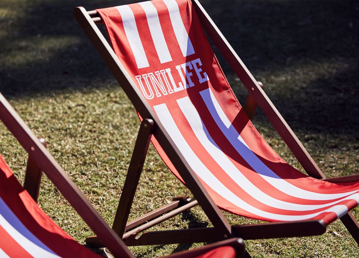
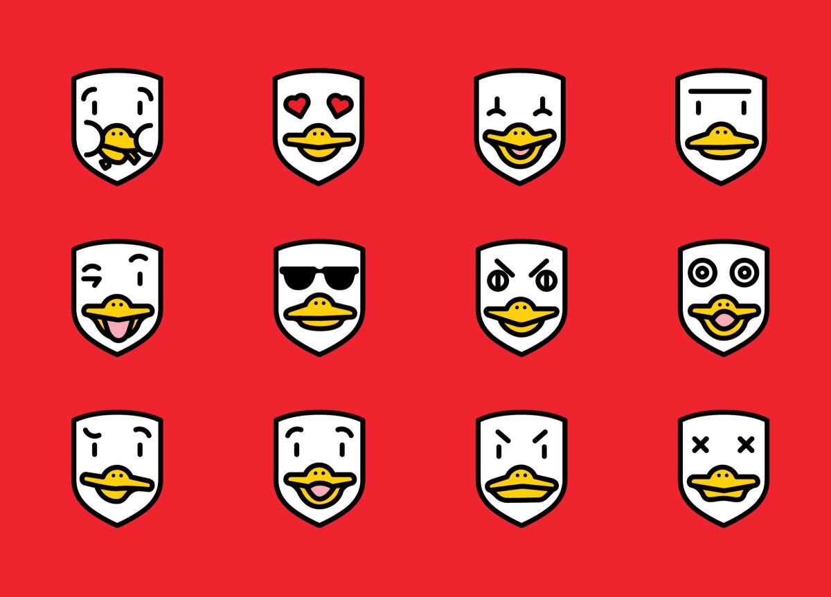
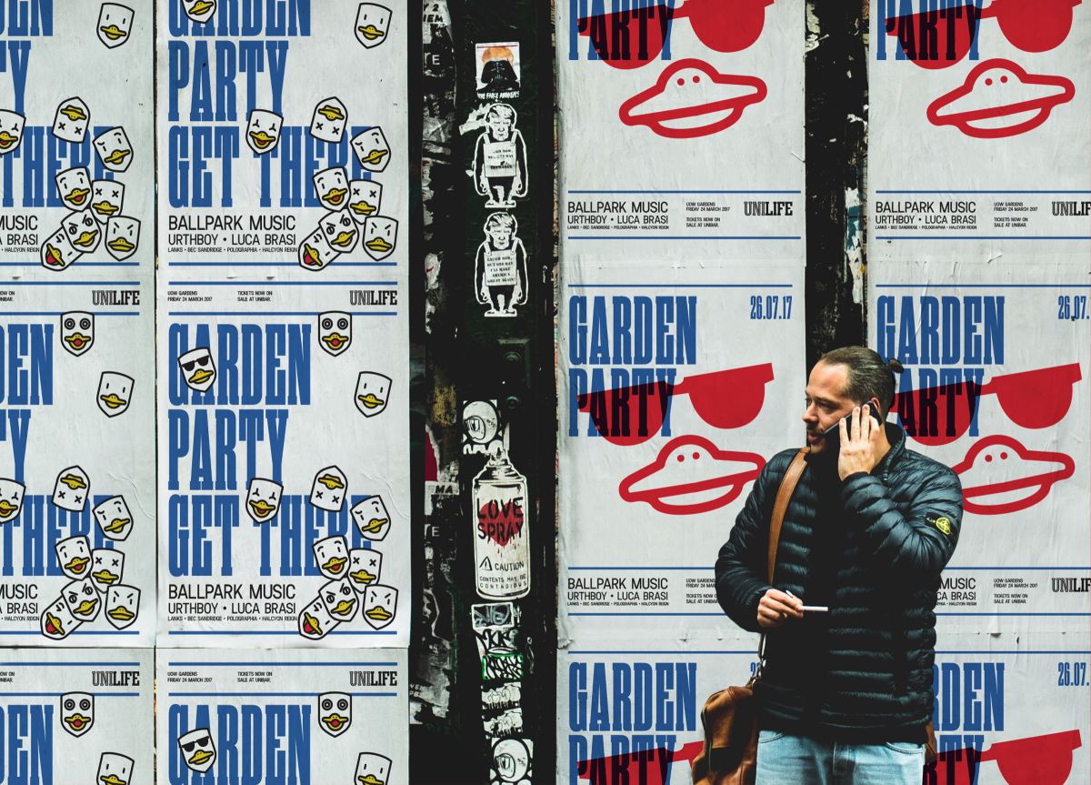
UOW are increasingly competing for international students, and need to communicate university life in a way that is globally appealing. A strong serif typeface is impactful and confident. We’ve used the parent brand colour palette to connect the new family back to the UOW brand. A series of duck illustrations bring UOW’s duck mascot to life and add layer of fun and can be easily applied to merchandise and uniforms.