John Holland Macquarie Square
As John Holland’s first project as developer, they were deeply invested in demonstrating the difference they bring to a project of this scale and potential. Our brief was to create a brand that could excite people around their new approach. The result is a brand that communicates a genuine lifestyle promise and an authentic sense of place.
Get in touch
John Holland Macquarie Square
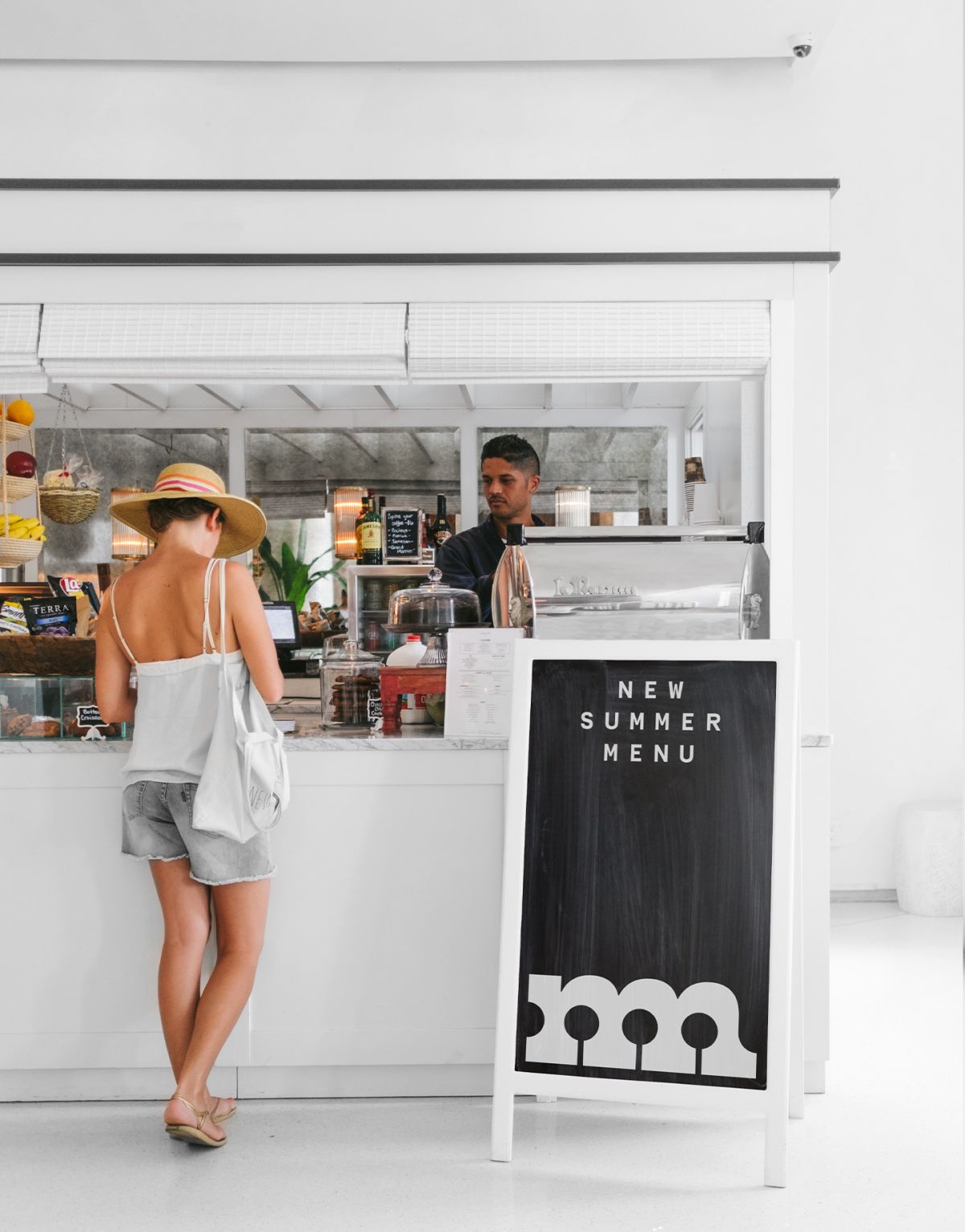
Modern marketplace
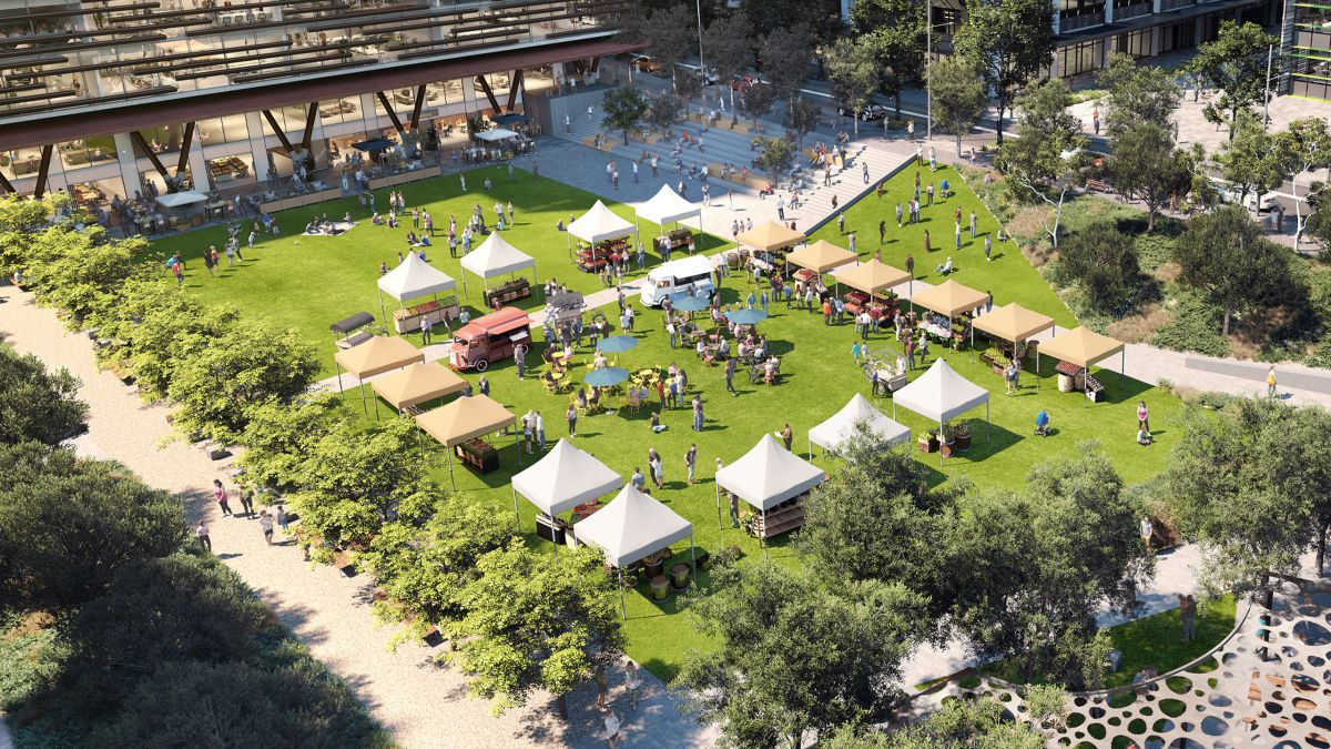
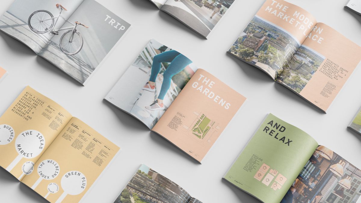
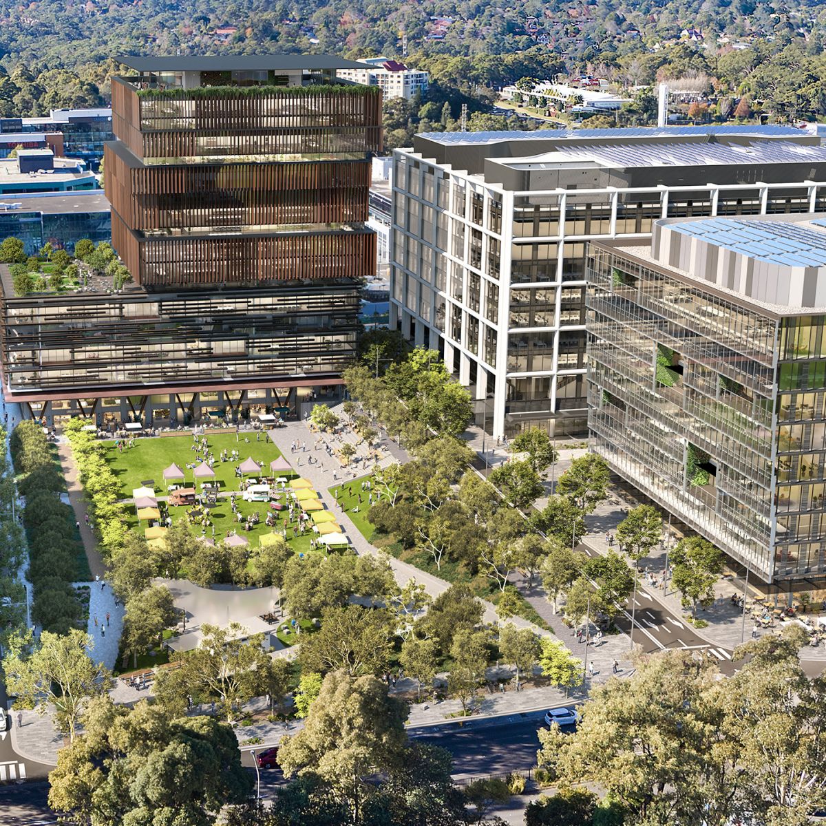
Macquarie Square is a new office and retail precinct in the heart of Macquarie Park. Centred around a 7000sqm public park, it’s designed to take all the ingredients of a modern marketplace and bring them together into a new type of destination, open to all. Here technology, commerce, innovation, wellbeing, culture, events, nature and more merge in new ways. As John Holland’s first project as developer, they were deeply invested in demonstrating the difference they bring to a project of this scale and potential. Our brief was to create a brand that could excite people around their new approach. The result is a brand that communicates a genuine lifestyle promise and an authentic sense of place.
Blending work and life
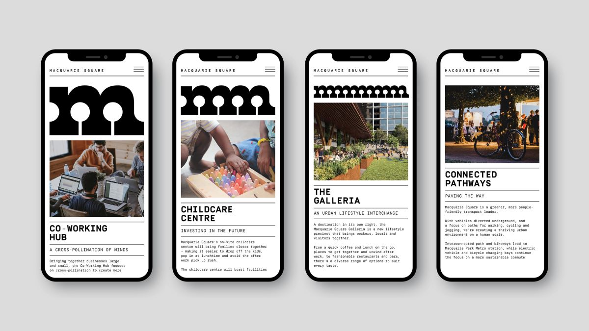
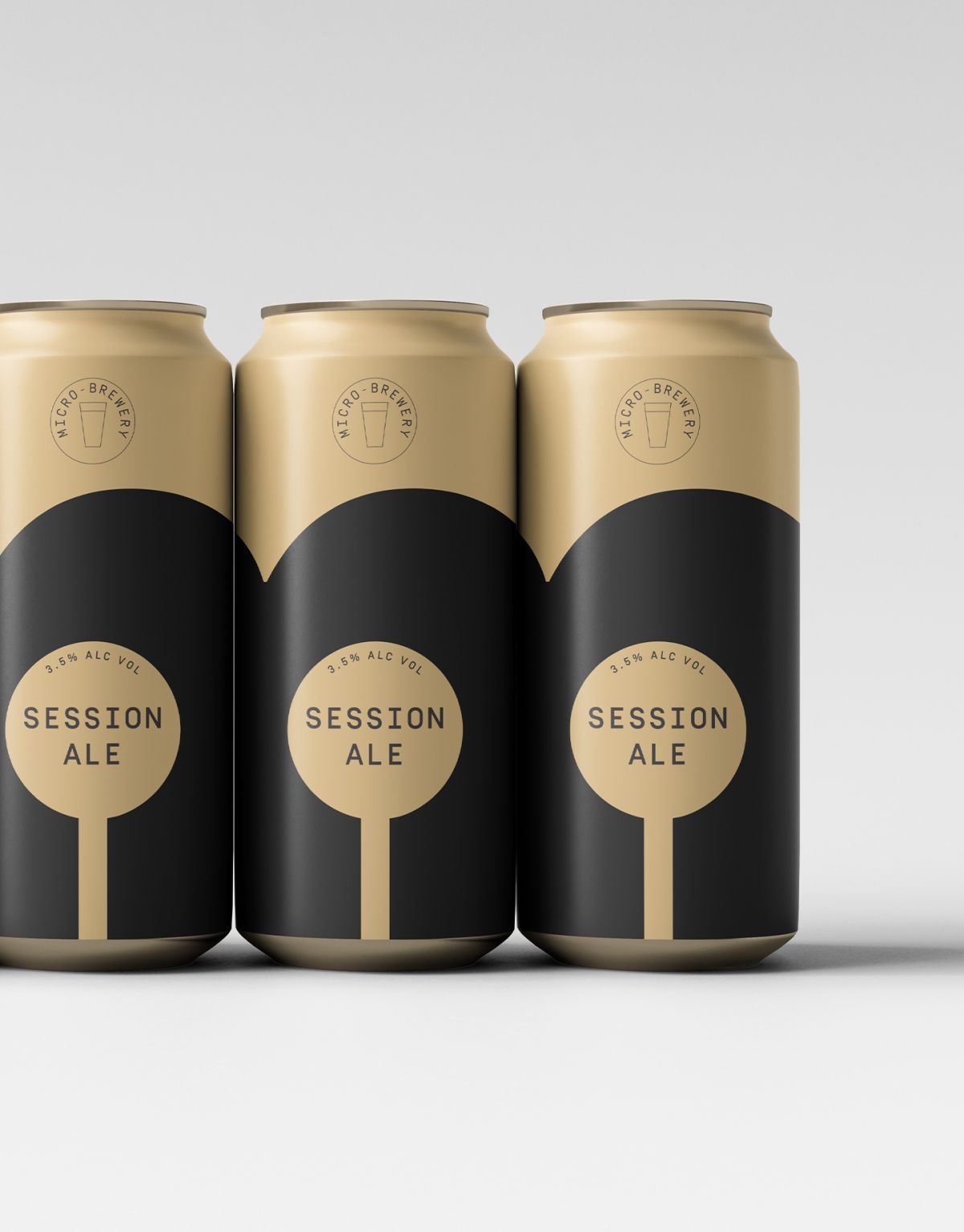
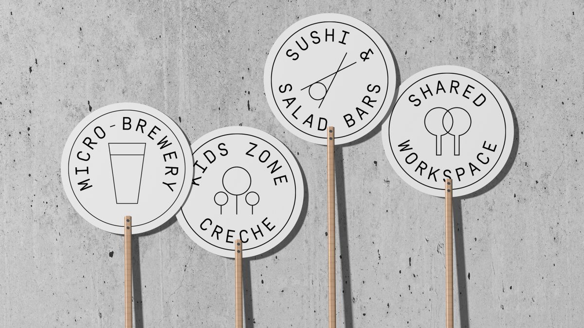
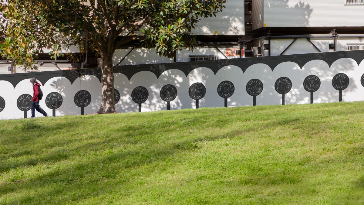
Today, life and work are so blended that ‘lifestyle’ has become critical to the success of commercial precincts. This is particularly true for locations like Macquarie Park, which are often seen as too remote from the action of places like the CBD. The vision for Macquarie Square was to deliver the type of lifestyle normally expected of the inner city on the site itself — including micro-breweries, restaurants, bars, a gym, running tracks and even a boutique hotel.
Transforming lives
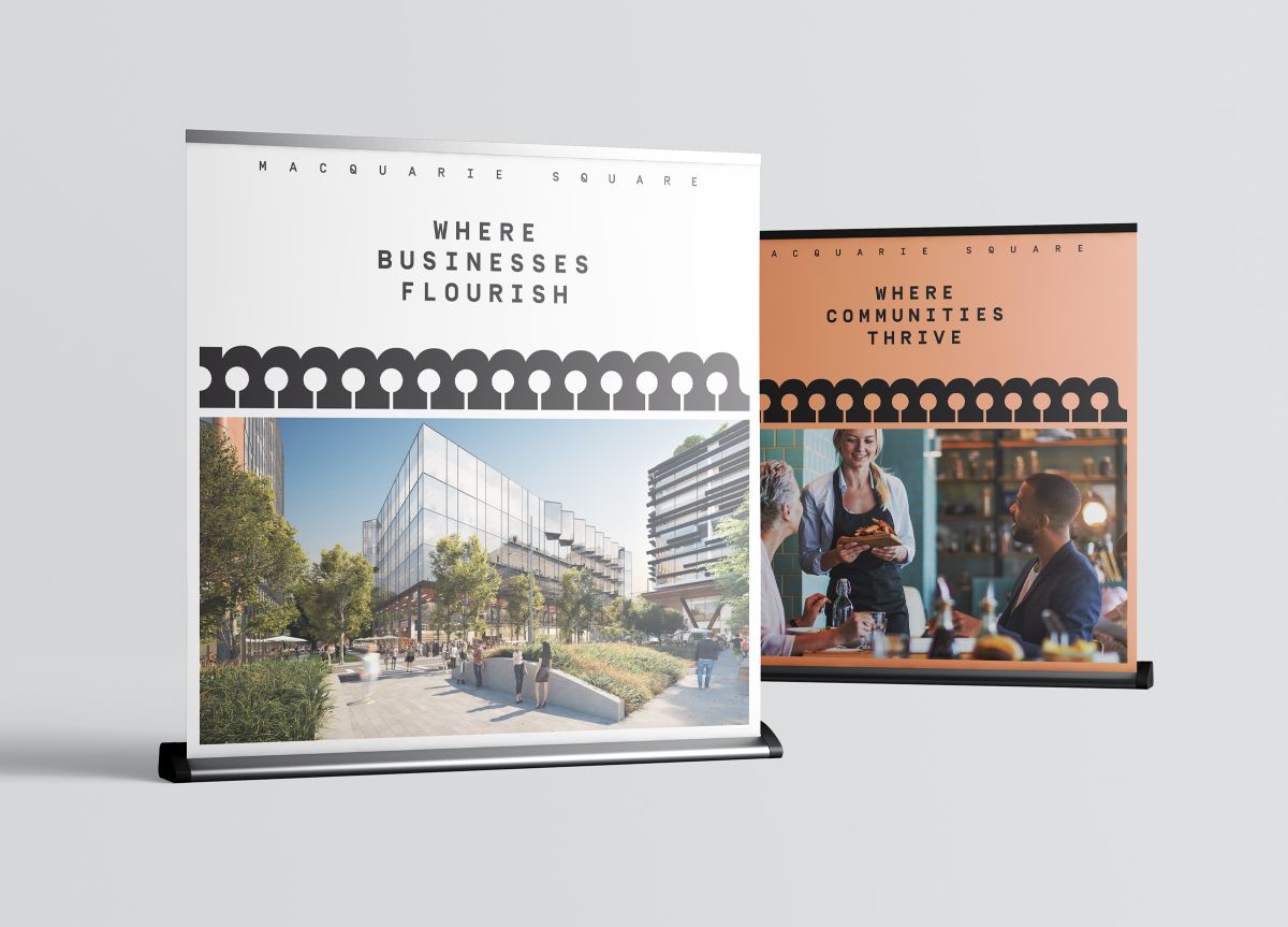
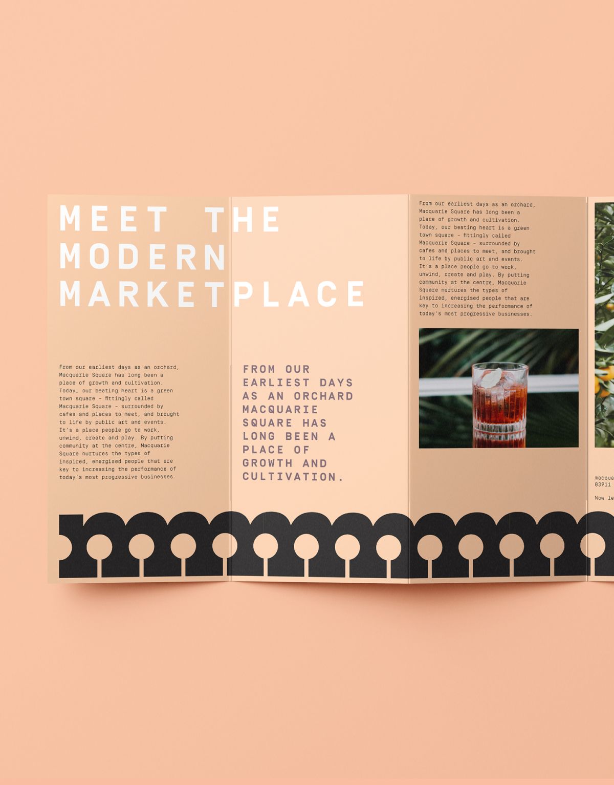
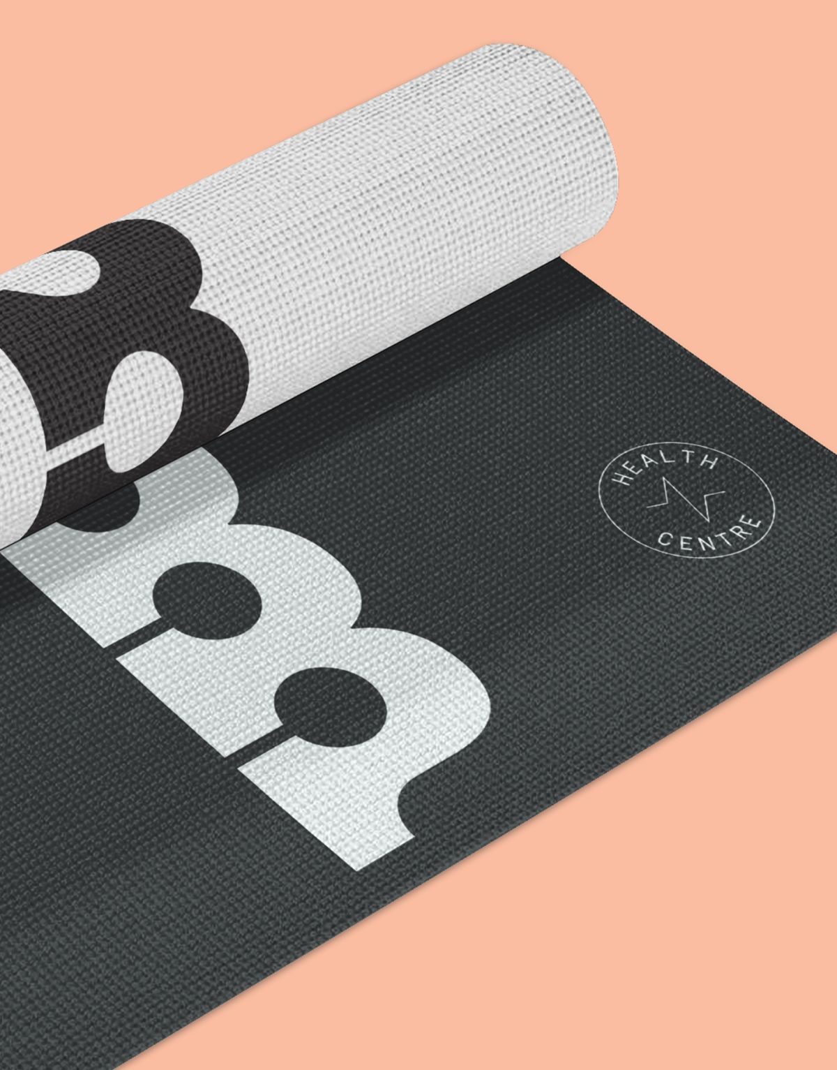
We worked closely with John Holland on developing its brand, anchored in the idea of ‘Transforming Lives’. Macquarie Square was an opportunity to show the difference this approach makes. We tapped into the heritage of the site, which was once abundant with orchards, and created a lifestyle brand that feels fresh and vibrant. It positions Macquarie Square as more than a place to work, but a marketplace of potential that blends work and life, enabling people and businesses to thrive.
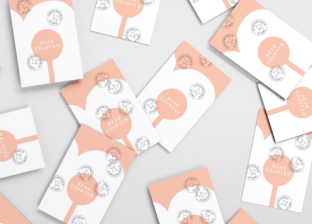
Back to the roots
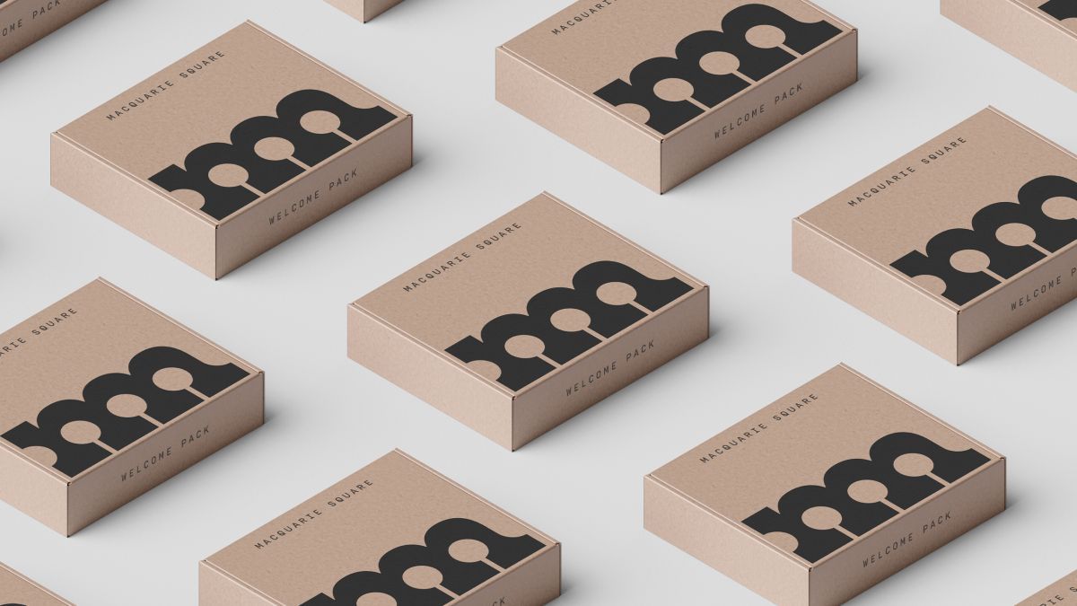
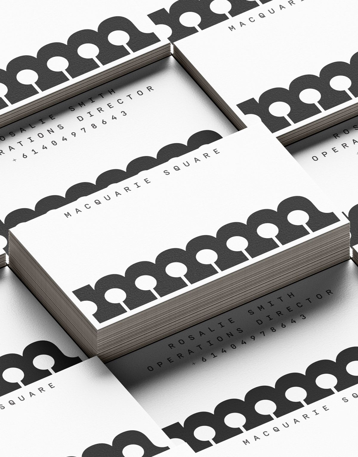
The core creative idea comes from the site’s roots as an orchard. The logo is formed from a series of trees comprised by the repetition of the letter ‘m’ in the precinct name. Used throughout as a graphic element, the orchard-tree logo also holds key messages and is accompanied by icons to make it easier to understand the diverse choices on offer. The design intent was to create a brand that feels approachable and community-led, reflected in the use of a soft, natural palette, a friendly news-style font and graphic elements such as stamps and iconography to tell the modern marketplace story in a contemporary way.
—
“John Holland approached Frost* with a very tight programme and large scope of works, which we were unsure we could achieve. Frost* were creative, professional and organised and within a week, they presented four entire concepts, which we loved. We sprinted to the finish line with some time to spare. The outcome was spectacular, culminating in a successful brand launch and subsequent financial returns. I wouldn’t hesitate in working with Frost* again, nor recommending them to others.”
Nicole Lasky, Development Manager, Property Development, John Holland
“This project’s success is a testament to true collaboration. John Holland is a visionary partner who recognises that the office market is changing, and our ability to bring their vision to life as a genuine lifestyle brand puts them in a position of strategic leadership in a highly contested market.”
Cat Burgess, Head of Place, Frost*collective